T-shirt design and logo placement guide for eye-catching shirts

Related Resources


It’s difficult to overstate the importance of t-shirt design placements.
In many ways, it’s an artistic choice, but a keen understanding of how to make the right decision on things like print location, print size, and proper placement of graphic elements can be the difference between a chaotic mess and a sharp, eye-catching t-shirt that effectively conveys your intended message or makes an impactful statement about your brand.
Fortunately, you can get started without being a print location expert. Following our t-shirt logo placement guide will help your t-shirts grab attention for all the right reasons. Where possible, we've provided an exact measurement for print sizes on Gelato’s Design Editor and referenced the appropriate anchor point for each measurement.
Main takeaways from this article:
Location, location, location: design placements are as - if not more - important than your designs themselves
Each design placement has inherent pros and cons; understanding these can help you make the right choice for your design
It’s critical to consider your audience, your chosen t-shirt’s style, and the shape of your design to ensure the most effective placement.

Essential terminology for print design
Print size
Print size defines the dimensions of your artwork on the t-shirt. It ensures the design fits well within the garment’s proportions, maintaining aesthetics and clarity. It is crucial for detailed graphics or text-heavy prints, as it aligns with the t-shirt’s overall look.
Print area
The print area is a specific part of the t-shirt where your design can go; it changes depending on the t-shirt’s style and size. It impacts the size of your design and where it sits on the clothing, affecting the overall look.
Print location
Print location is exactly where your design will go on the t-shirt. This decision dramatically influences how noticeable and standout your design is, which are crucial elements that shape the shirt’s appeal and how well it reflects your brand’s message.
Print placement
Print placement is all about carefully choosing where to put your design on the t-shirt. Getting it right boosts the conspicuousness of your design, keeps the wearer comfy, and helps the shirt’s overall look stay sharp and cohesive.
Maximum size
The maximum size is the most considerable area you can print on your t-shirt. This is determined by the printing technique and the shirt’s details, which are vital for keeping your design looking good and ensuring it fits well without taking up too much space.
Standard size
Standard size relates to the commonly used dimensions for prints, fitting within the industry norms for size and placement on various garment types. This size ensures the print is proportionate to the shirt, offering a balanced and harmonious appearance suitable for different styles.
Oversize
Oversize prints are designs that extend beyond the typical boundaries, creating a bold statement piece. They demand attention, transforming a basic t-shirt into a standout item, often used for artistic or impactful visual messaging.
Anchor point
An anchor point is a crucial reference during printing, ensuring your design lands in the right spot every time. It’s vital to keep things consistent across many shirts, guaranteeing each one is printed precisely and perfectly matches your design plans.
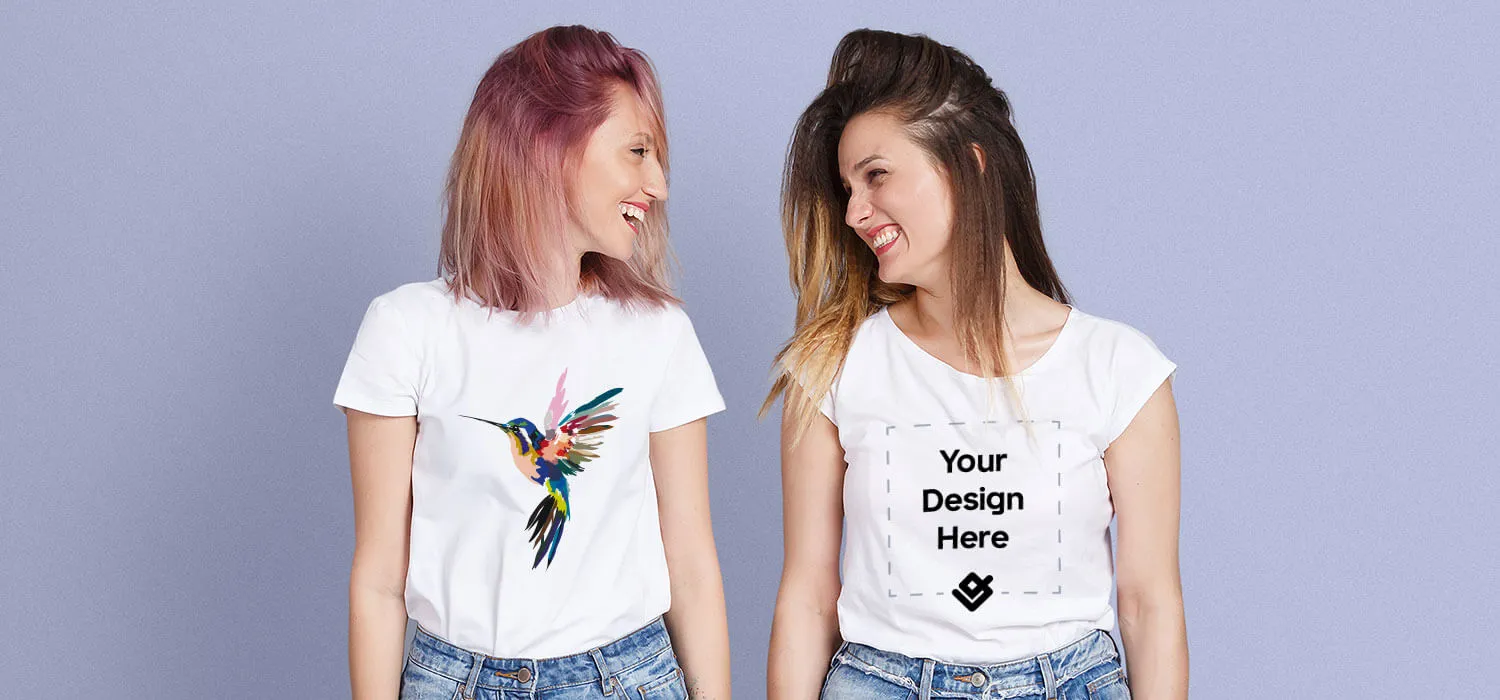
Front design and logo placement

A front t-shirt design placement is a versatile choice that works well with graphics of various sizes and complexity. Whether your message is artistic or utilitarian, front design placements make it easy for people to quickly grasp what a shirt is trying to communicate.
Depending on your design needs, there are few drawbacks to this placement. However, an essential consideration for front print placements is wearer comfort, as the size of your print area can impact your t-shirt’s breathability. Choosing a lightweight fabric can help make your t-shirt a customer favorite as a standalone item or as a base layer in colder temperatures.
Full front

Placement: About three inches down from the collar, along the centerline of the t-shirt.
Average design size: About 12” wide; 14” tall
A full-front design is a dependable, attention-grabbing print location. The generous print area is perfect for artists who want to create t-shirts with complex or detailed designs. This print placement is also well-suited for photographers who wish to showcase their best portraits or landscapes.
You might also consider a full-front design if you’re trying to make a strong impression for your company’s brand, raise awareness for an organization, or support a political campaign. A full-front design can also be a striking way to convey the theme of a concert, festival, or event, like a family reunion or group vacation.
Oversize front
Placement: Two to three inches below the collar, along the centerline of the t-shirt.
Average design size: 12” - 15” wide; 14” - 16” tall
When full-size front design placements don’t do your design justice, consider going for an oversized print, which adds half a square foot of print area to the t-shirt. Oversize images fill many of the same use cases as full-front prints, but the added space allows for even more intricate design possibilities.
An oversize print on the chest area is also a good choice if your online store sells extra-large inventory, as standard-size designs can look minuscule on plus-size shirts. Oversize prints are especially prone to breathability issues due to the extra ink required to print these designs.
Left chest
Placement: About three inches down from the collar, then straight to the left
Average design size: 2.5” - 5” wide; 2.5” - 5” tall
A left chest placement design instantly achieves a classic, understated look. They’re ideal for keeping branding on point for dressed-down corporate and professional gatherings where polo shirts might be too formal.
Choosing a left chest design is also an appropriate way to emphasize an element from the back of your t-shirt design, such as a staff shirt with SECURITY on the upper back. A similar approach is practical for sports teams and band merchandise.
Remember that your left chest design should not extend past the armpit seam. It’s also best to avoid using intricate designs in this space, which can affect readability. This placement’s subtlety makes it ineffective for sending a strong brand message.
Center chest
Placement: About four inches below the collar
Average design size: 8” wide; 8” tall
The front center chest print area is safe for big, bold branding and logo placement, simple artwork, and abstract designs. It’s best to avoid using this placement if your artwork is intricate, as fine details may be unclear to viewers at a distance, reducing the impact of your design.
Back design and logo placement

While most people think of front design placements for t-shirt layouts, back design elements can be just as powerful. They offer a unique avenue for creative expression and utility in professional situations.
An essential consideration for deciding on a back design placement is limited visibility. When the wearer faces others, there’s no way for viewers to see what’s on the back of the shirt. As a result, it’s a good idea to select a secondary printing location, such as the left chest or center chest on the front of the shirt. A sleeve design is another good option, but keep in mind that additional print locations will affect the production cost of your t-shirts.
Full back

Placement: About five inches below the collar
Average design size: Around 12" wide; 14" tall
Like front placements, a full back print effectively showcases large images or detailed designs. Full-back prints are ideal for t-shirt printing or jerseys for informal sports leagues. The print location provides enough space to accommodate player names and numbers, making it easy to achieve a cohesive appearance with minimal design skill.
Full-back prints are also a popular choice for band merchandise. The ample printing area is well-suited to listing a tour’s name and venues in a font size that’s easily recognized even from a distance, along with stunning art that can help frame the text.
Upper back
Placement: About four inches below the collar, between the shoulder blades
Average design size: Around 12" wide; 5" tall
Given its comparatively limited height, upper-back design placements are a good spot for secondary logos or slogans. Sports teams typically use this placement for player names, with numbers going on the full-back position. Placing a local sponsor’s logo in this area may also be appropriate, depending on the shirt's layout.
Employee-related designs like “SECURITY” or “STAFF” easily stand out in a crowd when placed on the upper back. This placement helps maintain a clean, organized appearance. However, adding the same information in another placement on the left chest or sleeve is important for improved visibility, which can add to printing costs.
Prominent upper-back design placement is also an excellent choice if you’re creating t-shirts for retail or service staff who may have the front of their t-shirt design obscured by an apron or similar garment. Your customers will be thankful that they can quickly identify employees in your store.
Outer neck collar
Placement: About an inch below the collar, essentially the reverse of the garment tag
Average design size: 1” - 3” wide; 1” - 3” tall
This subtle, creative placement is ideal for smaller designs without many intricate details. If you’re creating t-shirts for an amateur sports team, the outer neck collar can be an ideal placement for a local sponsor’s logo design. It’s also a good placement for details that complement a t-shirt’s main design features, such as a concert or event date.
Note that this print risks exposure to sweat, especially if your t-shirt will be used for an athletic event or worn by people in warmer climates. As a result, designs in this area are often susceptible to premature wear and fading.
Inner neck collar

Placement: Inside the shirt, just below the collar - essentially the “tag” area
Average design size: 2” - 3” wide; 1” - 2” tall
A t-shirt’s inner neck collar is one of the best-kept secrets for print placement locations in the t-shirt business. It’s a practical choice for maintaining a clean, minimalist aesthetic on the exterior of your shirt while still finding a home for your logo or brand information.
Placing your logo design inside the shirt creates a premium feel that’s especially appealing for designers who want to keep the focus on their t-shirt artwork rather than a logo. Designers can also use this print area to denote that a garment is part of a limited run, which can help reinforce a brand’s exclusivity.
Because the inside of your shirts will be in direct contact with the wearer’s skin, ordering samples of your shirt is a good idea to ensure the printing process creates a comfortable result that won’t irritate the wearer. Sweat and friction can also cause designs placed in this print area to wear or fade over time.
Sleeve design placement

Placement: About an inch above the hem on either the left sleeve or right sleeve
Average design size: 1” - 4” wide; 1” - 4” tall
Sleeve designs are another under-utilized t-shirt design placement. They’re an excellent spot for a highly-visible logo or branding placement that doesn’t overshadow a t-shirt’s primary design elements. T-shirt designers can also use the sleeve to complement a t-shirt’s primary graphic elements, as long as the sleeve’s intended artwork isn’t too complex or intricate.
When incorporated into t-shirts worn by staff at a business or event, designers can use graphic elements on a t-shirt’s sleeve to indicate seniority, helping employees and customers alike quickly identify staff leaders or management team members. The relatively small print location also means that logo designs and graphics must be large and bold to communicate their message successfully.
Optimal t-shirt design placement for logos, artwork, and text-based designs
When placing a logo on a t-shirt, aim for clear visibility and resonance with your brand. The left chest symbolizes the logo’s importance, while the center chest suits a more casual style, perfect for more extensive, intricate logos. Ensure the logo’s size is proportional, about three to four inches wide.
The entire front or back is your canvas for artwork, ideal for making a bold statement with detailed graphics or images that tell a story. Consider the shirt’s color and style to ensure the artwork fits well. For a touch of creativity, you can also place smaller, subtle designs on the upper chest or near the hem.
Text designs should be front and center for maximum impact, especially on the center chest, where they’re most visible. The size and clarity of the text are vital so it’s readable and impactful. Subtle text can go on the upper back or hemline, blending well with the shirt’s overall look. The key is to balance the design’s placement, ensuring it’s noticeable and engaging.

Design placement tips
While many design considerations are unique to specific t-shirt print areas, we've gathered a few tips and general best practices for design that will help you create impactful t-shirts that resonate with your target audience.
Factor in the shirt's style
A t-shirt’s style can drastically alter its available print location and measurements. For example, a design with many vertical elements may look fine on a crewneck but could sit awkwardly on polo shirts, v-necks, or scoop-necks. Ensure you also factor features like pockets and elements like the shoulder seams into your design considerations, as they can distort your designs if not accounted for.
Remember your audience
Before embarking on any t-shirt printing project, you should know who will ultimately wear your shirts. For example, if your target audience skews younger, unconventional graphic design placements and visual elements may be desirable or signature elements of your designs. Older customers will likely favor understated graphics and subtle branding or logo placements.
Meanwhile, emphasizing branding and logos with your placement choices is essential if you’re designing t-shirts for a sports team or corporate event. Similarly, if you’re putting together a t-shirt for a group outing, like a family reunion or vacation, ensure your designs prominently include those elements.
Consider your design's shape
Some designs naturally fit specific placements. For example, sleeves are an excellent spot for long and narrow designs, whereas front and back placements may better suit circular, rectangular, and square graphic elements.
It’s also important to consider how different shirt sizes impact your design’s shape and how your designs will look on different body types. For example, people who wear plus-size clothing will not buy a garment if the design's print size looks tiny, as the disparity can draw attention to their size.
While there's no hard-and-fast placement guide for special sizes, altering your design and logo placement to accommodate a wide range of sizes and fits will increase the size of your addressable market. Positioning your brand as an ally for the burgeoning body positivity movement could help you grab market share from competitors focusing exclusively on standard sizes.
Finding the perfect placement for your t-shirt designs
The placement of your brand logo on a t-shirt is arguably more important than the design itself: a lousy placement can muddy your message and damage your brand by making you look like an amateur.
In other words - don’t put a ton of work into your design only to stumble at the finish line with DIY screen printing.
Take advantage of our placement guide, then check out Gelato’s print on demand services to ensure your designs hit the mark every time. Upload your design to experiment with Gelato’s Design Editor and mock-up generator to see your graphic on hundreds of men’s, women’s, and kids’ shirts, as well as a digital representation of the final product on models with various body types.
Learn how easy it can be to create t-shirt designs online with Gelato today.
T-shirt design and logo placement FAQs
What side of the shirt does the logo go on?
Traditionally, logos are positioned on the left chest side of the shirt, aligning with the heart to subtly signify the brand’s importance and value. This favored placement ensures the logo is consistently visible, making it a universally recognized spot for enhancing brand recognition, particularly effective for both professional attire and casual wear.
How does shirt color affect design placement and visibility?
The shirt’s color is vital to how well a design stands out and gets noticed. Dark designs pop on light-colored shirts, giving a bold contrast, and light designs look excellent against dark shirts. Choosing the best color mix ensures your design catches the eye, boosts the shirt’s look, and showcases your logo or message, and this is essential for solid branding and making a lasting impression.
Does the printing method affect design placement?
The choice of printing method can significantly impact the placement possibilities and the final appearance of the design. Direct-to-garment allows for flexible design placement on different fabrics and generally lasts long. Each method has specifics that impact the placement options and the detail and brightness of the final design. These factors play a significant role in the look and longevity of the printed design.
What are the current trends in shirt design placement in fashion?
Fashion trends currently favor innovative design placements, breaking traditional boundaries. Designers are experimenting with asymmetrical designs, large-scale typography, and extended patterns that wrap around the shirt or extend from front to back. These trends challenge the norms and encourage creativity, leading to unique garments that stand out in the fashion industry and reflect individuality and contemporary style preferences.
How far down a sleeve should a logo be?
Usually, a logo goes two to three inches down from the sleeve’s shoulder seam. Manufacturers choose this spot so the logo stands out, whether the arms are still or moving. It keeps your brand in plain sight and enhances the shirt’s look. The logo fits perfectly with the sleeve’s style and the shirt’s overall design, adding to its visual charm.