Body Proportion
This unit is intended to teach students how to draw a basic human body using the correct proportions. It spans approximately four art lessons (60 minutes each). Given the young age of my students and the language barrier involved (most of my students speak Swedish as their first language), I had to distill these ideas down to the basics. Where to start?
First off, does everyone know the names of the body parts? I used a wooden artist’s mannequin to illustrate this to my students. The students will work with a basic figure while we become familiar, not only with the conventional “ideal proportions”, but also with the way they vary.
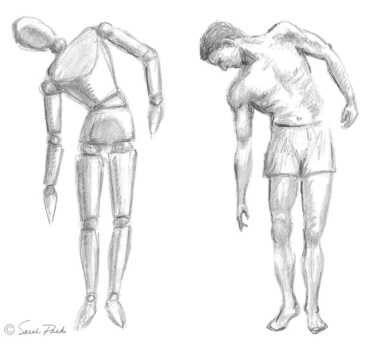 Image reference: http://anu.drawingsecretsrevealed.com/
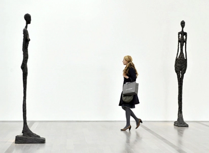
I wanted to establish if my students could differentiate between perceptions of ‘right’ and ‘wrong’ body proportion in art and illustrations. To demonstrate, we first looked at surrealist sculptor Alberto Giacometti (1901 – 1966), and I asked the students if Giacometti has used the ‘right’ body proportions for an adult human.
Alberto Giacometti, GRANDE FEMME IV, 1960 and GRANDE FEMME III, 1960
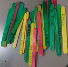
What is ‘wrong’ here? For this question, I implemented a bit of formative assessment ‘no hands up’ using lollipop sticks to randomly select students to pick out the aspects of this sculpture that were not in proportion. We agreed that these sculptures were very tall and slender, their heads were very small and their feet were very large.
We had a discussion about why Giacometti made his sculptures this way.
“In the late 1930s, Giacometti abandoned abstraction and surrealism, becoming more interested in how to represent the human figure in a convincing illusion of real space. He wanted to depict figures in such a way as to capture a palpable sense of spatial distance, so that we, as viewers, might share in the artist’s own sense of distance from his model, or from the encounter that inspired the work. The solution he arrived at involved whittling the figures down to the slenderest proportions.” (The Art Story)
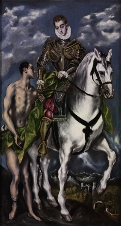
We then looked at a few more examples that also demonstrate the ‘wrong’ body proportions. I showed the students some paintings by mannerist artist El Greco (1541 – 1614) and we agreed that the figures almost looked to have the ‘correct’ body proportions but actually had elongated limbs. El Greco discarded classicist criteria such as measure and proportion. His preference for exceptionally tall and slender figures and stretched compositions led him to disregard the laws of nature and elongate his compositions to ever greater extents, particularly when they were destined for altarpieces.
Doménikos Theotokópoulos (El Greco), ‘St. Martin and the beggar’, 1599
To reference more contemporary and approachable examples, I showed the cartoons of Homer Simpson from The Simpsons (Matt Groening) and Stewie Griffin from Family Guy (Seth MacFarlane). It was agreed that in particular their heads were very large and their arms were very short.
 Stewie Griffin, Family Guy (Seth MacFarlane)
So up next, where can we find the ‘right’ body proportions in an artwork. I showed the students the British sculptor Antony Gormley (1950 – ). Many of his works are based on moulds taken from his own body and are therefore generally true to form. “The work is not symbolic but indexical – a trace of a real event of a real body in time.” (Walks inside Florence)
Antony Gormley, ‘Still Standing’, 2011-2012
So, we now had a good idea of how body proportion can look ‘right’ or ‘wrong’. Down to the drawing, I asked students to watch a quick video detailing some rules and strategies for drawing the human body – ‘How to draw people‘ by Mary Doodles.
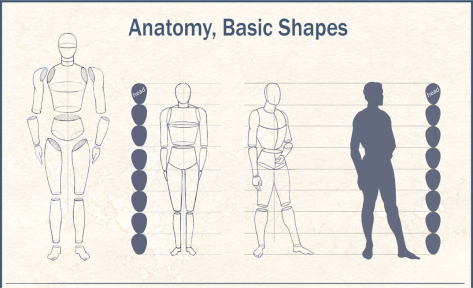
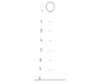
The students were then asked to use their head! to work out the correct body proportions for a specific head size. In general, an adult human figure is between 6 – 8 heads tall and 3 heads wide.
I showed them how a average adult human can be measured using their head and did a quick demonstration on the board. “A well-proportioned figure, regardless of variations due to gender or such, is defined by the alignment of the joints, which is invariable (that is, we perceive something odd if it does vary). This is our groundwork for proportions.” (Human Anatomy)
Image reference: http://comicbookgraphicdesign.com/comic-art-reference-anatomy-basic-shapes/
Image Reference: http://design.tutsplus.com/articles/human-anatomy-fundamentals-basic-body-proportions–vector-18254
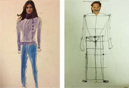
From here, I demonstrated drawing a magazine sketch. This involved finding a good sized head from a magazine, cutting it out and sticking it to an A4 page. The students were then required to find the height of their figure using their chosen head size. Next, the width – again using the head measurement. From there, they needed to find the half way point between the top of the head and the feet. This helped the students draw the chest and pelvis. Finally, arms and legs were added.
Student works, Aged 10, 2015
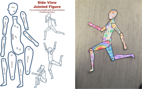
The next step was to create a jointed figure. The students were asked to colour their figure and then cut and pin the parts together. This was a quick exercise to get the students familiar with adult body proportions and to provide a visual reference for their drawings.
Image reference: http://elementaryassistant.com/2014/08/13/poseable-jointed-figure-paper-template/
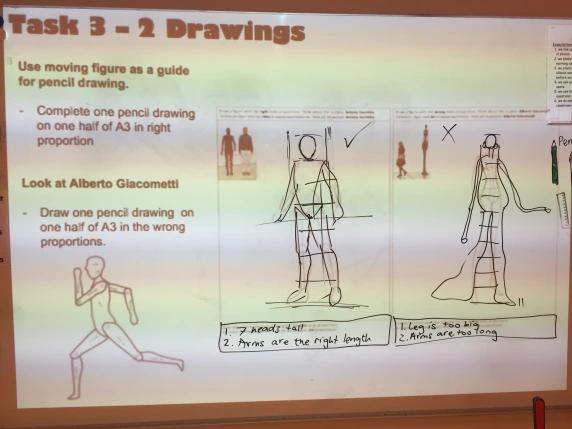
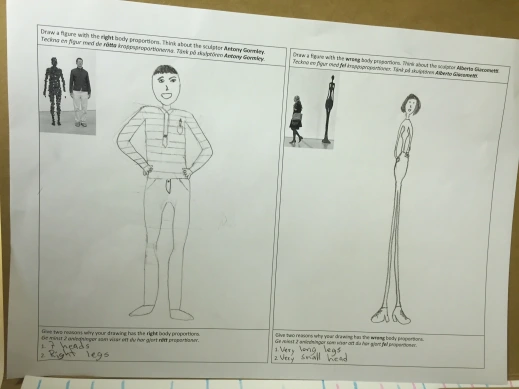
Finally, using our magazine sketch and jointed figure as reference, I asked the students to do two final drawings. One where they have tried to get the ‘right’ body proportions and one where they try to get it very ‘wrong’! They liked doing it the wrong way. It was a great way to compare the two drawing and reflect on what we did to render one drawing one way and the other another way.
Whiteboard demonstration, 2015
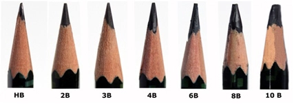
So again, I demonstrated the drawing techniques that we had learned previously. I showed the students the number code on drawing pencils and explained what this actually means. We decided that a 2B pencil would be good to use for our sketch and a 6B would be good to do shading as it was softer and ‘smudged’ better.
Student work, age 10, 2015
The students reflected on the small changes and alterations they made to get the proportions correct in their ‘right’ drawing and how this influenced their ‘wrong’ drawing. I think in retrospect it might have been a little technical for the age group and I could have done better with my scaffold and structure for the specific steps required to create a proportional human figure drawing. However, I think the students did a great job!
Further ideas:
This is a good idea for a proportion lesson using pop artist Keith Haring (1958 – 1990):
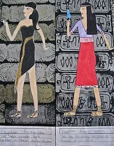
Or a body proportion lesson based around Ancient Egyptian artworks?
Image reference: http://abcschoolart.blogspot.ca/2011/10/walk-like-egyptian-6th.html
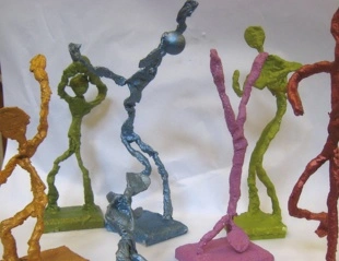
or Giacometti wire sculptures?
Image reference: http://emilyjanevalenza.com/3rd-grade/2013/1/24/giacometti-figure-sculptures
