[Versión en español aquí]
I really wanted to dedicate some time to make a static dataviz, one in which I could apply everything I have learned over the years in terms of data visualization. I love data visualizations that have to do with music, so what better than starting with a visualization of the band that has most marked me personally: Depeche Mode. I wanted it to be a well-known album and, although it is not my favorite of all their discography, I chose Violator, released in 1990, because it was probably the album they sold the most copies of and the one that definitively established them worldwide, after their growing success in the 80s. It has been a visualization made in Illustrator, with the help of other tools like R, Flourish or WaveFormer, I hope you like it!
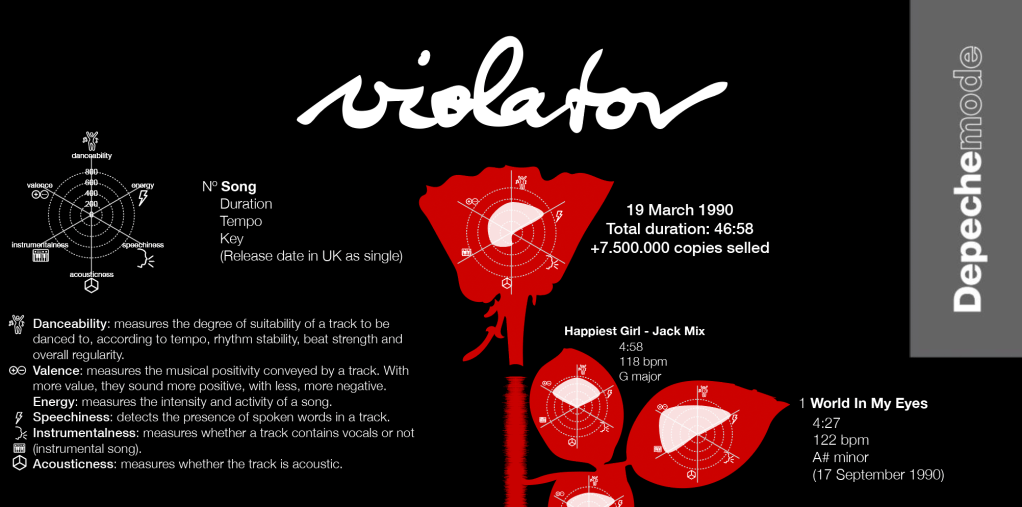
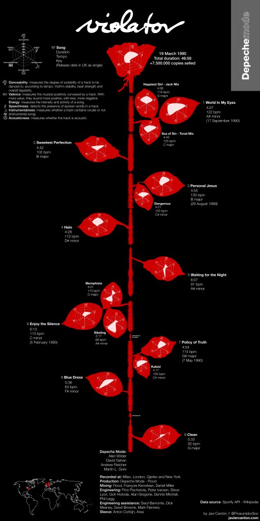
The visualization uses the metaphor of the rose on the album cover. Each leaf represents a song and the stem is the sum of the audio waves of each song. For each song are shown the duration, tempo and key, in addition to several parameters extracted from Spotify, each identified with a small icon, specifically:
- Danceability: measures the degree of suitability of a track to be danced to, according to tempo, rhythm stability, beat strength and overall regularity.
- Valence: measures the musical positivity conveyed by a track. With more value, they sound more positive, with less, more negative.
- Energy: measures the intensity and activity of a song.
- Speechiness: detects the presence of spoken words in a track.
- Instrumentalness: measures whether a track contains vocals or not (instrumental song).
- Acousticness: measures whether the track is acoustic.

According to these parameters, the most danceable songs of the album (excluding B-sides) are «Halo», «Personal Jesus» and «Policy of Truth», authentic hits of the album. The song with more energy and positivity would be «World In My Eyes». And the one that includes more vocals and instrumentation, «Enjoy The Silence». In those songs that were released as singles, the release date is also shown. And also those discards of the album that were released as b-sides of those songs. The credits of the album and a map with the four cities where it was recorded are also added at the end.
How was the creation process? Let’s start at the beginning: the sketch. The creation of the infographic was clear from the beginning, with the metaphor of the rose on the record. The final infographic did not differ much from the original idea, although at first I was going to include the audio waves inside the sheets. The result stained a little the result and, as wisely advised me the wise Ferrán Morales, it was better to remove them. Less is more. And every cloud has a silver lining: thanks to that I was able to create the stem of the rose from the audio waves.
I downloaded the data through R, using the SporifyR package. A few lines of code and you have the complete excel with all the data provided by the Spotify API. Of course, to access the API you have to create a developer account to have the «client ID» and «client secret» codes.
require('spotifyr')
Sys.setenv(SPOTIFY_CLIENT_ID = 'xxxxxxxxxxxxxxxxxxxxxxxxxxxxxxxx')
Sys.setenv(SPOTIFY_CLIENT_SECRET = 'xxxxxxxxxxxxxxxxxxxxxxxxxxxxxxxx')

library(spotifyr)
library(xlsx)

access_token <- get_spotify_access_token()

dm <- get_artist_audio_features('depeche mode')
write.xlsx2(dm, 'dm.xlsx')
The SVGs with the audio waves that make up the stem of the flower were created using the Waveformer tool, created by Misha Heesakkers. To do this, I had to extract the songs from the album in MP3 format and pass them through this tool. Once created, it was a matter of coloring and rotating them to integrate them into the infographic. If you sharpen your eye, you will see the detail that there is a small separation between the fifth and the sixth song, as it happens on vinyl: the first part of the stem, therefore, is Side A, and the second, Side B.

For the visualization of Spotify’s parameters, what would be the leaf spots, I resorted to Flourish, which allows me to download the visualizations in SVG so I can take them to Illustrator. The interactive is published and you can see it here. With all these elements, it was just a matter of time to take them and assemble it in Illustrator.


[…] [English version here] […]
Me gustaMe gusta