

While the lion is an old and widely used symbol, you can rarely see a lion car logo. The reason is probably that the symbolic meaning of this animal does not include “speed,” which is something crucial for a car logo. Interestingly, even the griffin (a lion with an eagle’s head and wings) is used more often. This makes perfect sense as the griffin has wings, and thus, is speedier.
What does Lion stand for on car logos?
One of the most famous animals for representing strength and power, a Lion, is not widely used by the world’s automakers, as the king of the animals is not associated with speed. Although the brands that value traditions, such as Peugeot, managed to make the Lion suitable for the auto badges.
Here are some of the most common associations implied by the lion:
- kingly power and might, authority (the king of the beasts)
- dignity
- courage
- ferocity.
The lion is very often used in heraldic art (for instance, it is a common emblem of English sovereigns). Some of the aspects of the lion’s heraldic symbolism include:
- honor
- royalty
- strength
- leadership.
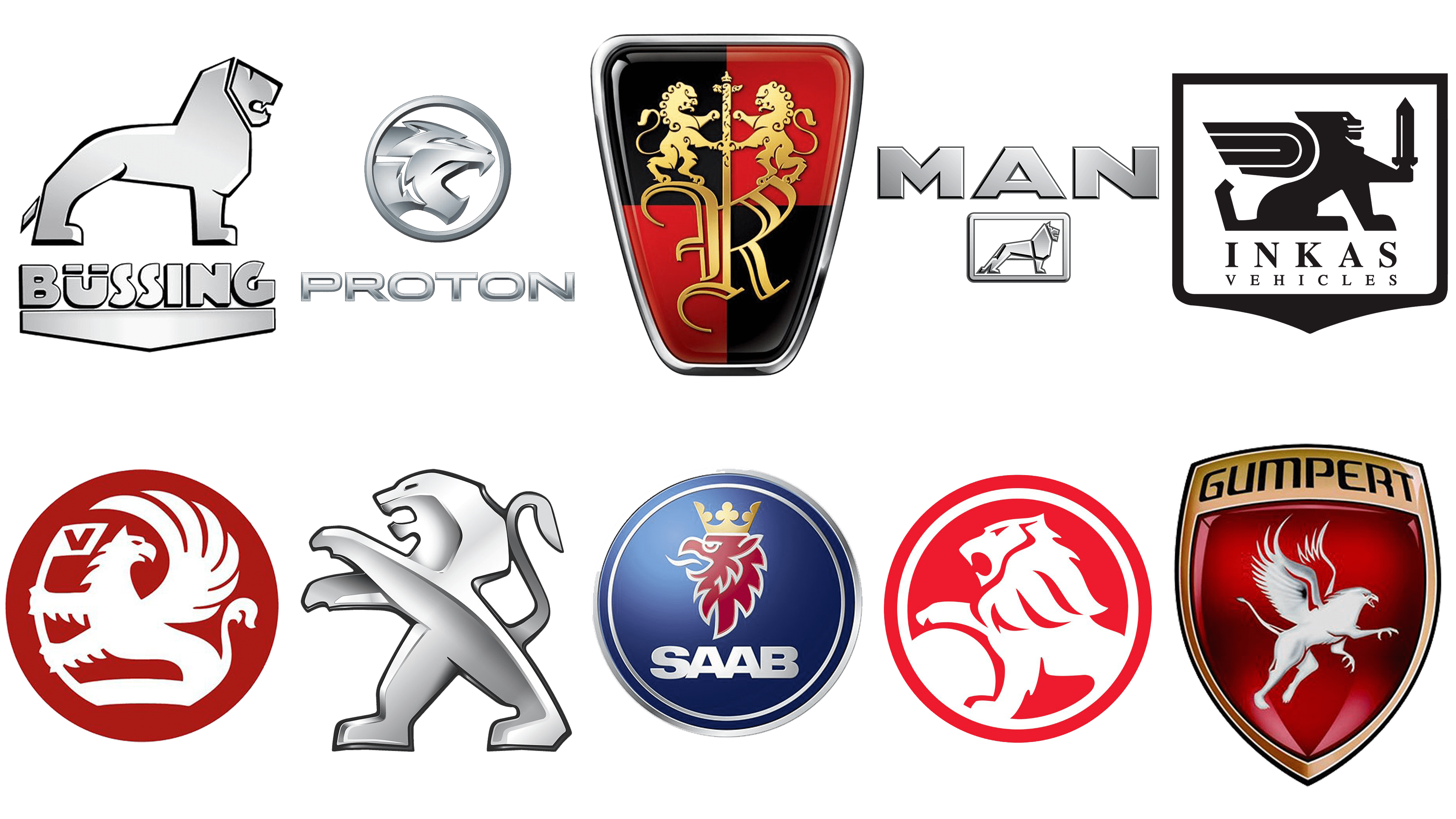
Peugeot
![]()
The French company adopted a lion car logo long before the first vehicle was manufactured. The first lion logo was introduced in 1847 when the Peugeot family was known as the manufacturer of steel products. The animal was chosen partly because of its jagged and sharp teeth – they represented the strength and sharpness of Peugeot’s products.
However, it only started to be used on the bonnets of the cars in 1948 (the year when the 203 model was unveiled).
The emblem has gone through multiple updates.
The original design featured a rather realistic lion walking on his four paws. There was an arrow under his feet, a symbol of sharpness. While the original lion was wearing a crown, in 1889, the crown disappeared from his head.
In 1905, an intricate design featuring a wheel and the lettering “Peugeot Paris” was introduced.
In 1910, the lion changed its direction (it was now facing to the right) and position (one of the front paws was lifted).
In 1936, a shield with the lion facing to the left was adopted.
The 1948 logo looked somewhat similar to the current one in terms of its structure, although the current version is by far more minimalistic.
Roewe
![]()
The Roewe badge seems to have been inspired by the coats-of-arms of medieval knights or even royal families. The design deliberately ignores current tendencies – it stands out among modern minimalist, clear car logos (like Mazda’s, Toyota’s or Renault’s logos). It is even “older” than the previous Peugeot’s lion, to say nothing of the current one.
The design forces behind the Roewe logo opted for the “knight’s” shield as it perfectly reflects the name of the company, which consists of the Chinese characters Róng and wēi (“glorious power”). SAIC claims the name of the company comes from the German word for lion (“Löwe”), which is another reason for using a lion in the logo.
Holden
![]()
Since 1928, the logo of Australian carmaker Holden (formerly known as General Motors-Holden), has always featured a lion rolling (holding) a stone. The emblem represents a fable telling how the wheel was invented. According to the fable, the wheel was invented by people observing lions rolling stones.
The logo has gone through at least three updates. The original elliptical badge featured a white lion with the word “Holden” above. In 1948, the lion grew red (black), the ball became more prominent. The position of the lion’s head changed. Another update took place in 1972.
The 1994 logo looks very similar to the current one, although there have been some playing around with the colors and typefaces.
Logos featuring a griffin
A griffin is a lion with an eagle’s head and wings. Although it is just a mythic creature, you can find more griffin car logos than lion car logos. The list of car logos featuring a griffin includes Saab, Vauxhall, Scania, Gumpert, and Iso.
There are many brands that prefer to put lions onto their emblems, and not just because it’s a ‘king of the animal world’. Lions are notoriously fast, enduring and strong. These are the qualities people usually cherish in their cars.
Proton (Malaysia)
![]()
Proton is a prominent Malaysian car brand founded in the late 20th century. They mostly make compact cars, including smaller crossovers. The lion imagery was first adopted in 2000 and hasn’t been changed much since then. It’s a picture of a lion’s head with a wide open mouth, likely mid-roar. There aren’t too many features or details, as these are usually made from (or depicted as) metal.
MAN AG (Germany)
![]()
MAN AG, aka MAN Truck & Bus is a German vehicle manufacturer. As per name, they mostly make big trucks and buses. Many of these sport a rectangle badge with a lion posing inside. This particular lion is shown in full, although they didn’t add a lot of nuance while developing the look. It’s supposed to be made out of metal, and thus there are mostly just crude geometric forms.
Büssing (Germany)
![]()
Büssing was one of the chief producers of trucks and buses in Germany until the company dissolution in 1971. They actually gifted their lion emblem to MAN, with which they merged thereafter. Their lion was a slightly more detailed, and they always put it on top of a plaque saying ‘Büssing’.
INKAS (Canada)
![]()
INKAS is a Canadian company that focuses and safety and security. As part of it, they make armored vehicles in large quantities.
The brand’s emblem reflects just that: it’s a blue, wide shield with a silver lion in the middle. The beast has protruding from the back, as well as a sword in its outstretched front leg. The INKAS lion is not very detailed, as it’s fashioned like a piece of metal, like many other brands did with their emblems.


